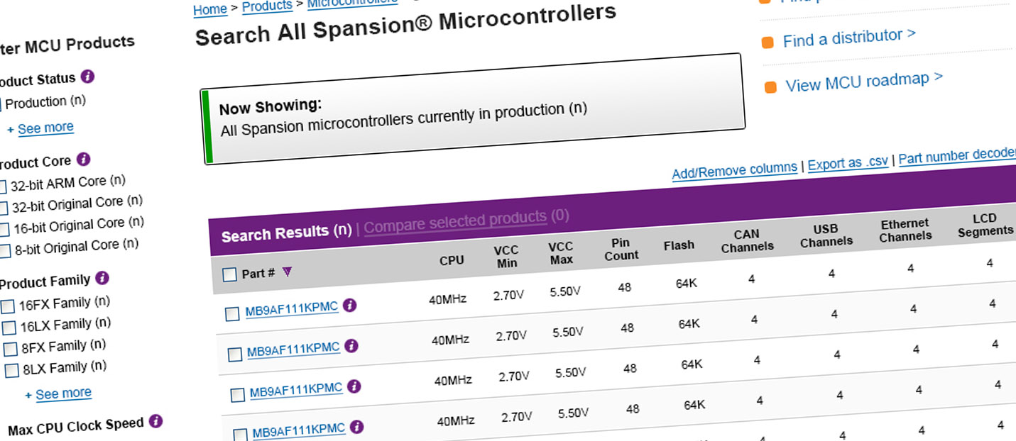
I redesigned the the product search and product pages for Spansion Microcontrollers to make them clearer and easier to use, to provide findability to specific products for specific purpose, and to integrate 3rd-party ecommerce capability.
After their recent acquisition of the Fujitsu microcontroller line of business, Spansion had a need to merge this very large new product line into its existing product line and represent all their products in an easy-to-find, easy-to-understand and consistent presentation, as well as to provide a branded and ‘seamless-as-possible’ integration with Avnet, their chosen ecommerce platform.
The integration of the Fujitsu product line in a reasonably usable way was complex, as it comprised hundreds of specific product configurations, each including (or not including) product specification data, schematic diagrams, manuals and support information, product summaries and marketing information, application-specific alternatives, pricing data, photographs and more. These data points were in largest part different and in different format than data for the existing Spansion product line and had to be normalized.
I redesigned the product pages for the Spansion website to make them clearer and easier to use, to provide findability to specific products for specific purpose, and to integrate 3rd-party ecommerce capability. I designed a new information architecture, navigation and wayfinding sytem. I designed a new faceted search system specific to products. For each of these projects, I served as the single UX Designer and worked closely with my product and development team, as well as with the client team, to perform and report on all research; to assist in requirements definition and scoping; to define information architecture, workflow and interaction; and to perform all visual design/UI work.
I defined and performed all research and discovery activities, including analysis, reporting and recommendation. I was highly involved in requirements definition, scoping and scheduling. I redesigned information architecture, workflow and interaction. I did all visual/UI redesign work.
I conducted thorough stakeholder interviews with Spansion and Fujitsu engineers, product managers and application engineers. I did a thorough review of published industry demographic studies and sat with multiple customers representing understood customer segmentation. I performed a thorough comparative analysis of the websites and features of Spansion’s top five competitors.
These activities summarize activities undertaken as a means of requirements discovery. I compiled and analyzed results and presented Spansion executives with a set of well-reasoned UX requirements recommendations, including: Redesign of navigation system, including redesign of primary and secondary navigation, introduction of global breadcrumbs and other wayfinding affordances such as product tree on product pages; Terminology review and simplification, and provision of inline definitions; Replacement of existing parametric search system with a simpler and more usable faceted search system; Engagement users and drive action through simpler product summary specs, family-level landing pages, and find-by-application function.
Immediately below are selected images from the discovery documentation
All recommendations were well-understood, agreed on and accepted as project scope. Working hand-in-hand with my development team, I provided design solutions for all scope items. Immediately below are selected images from design documentation:
I was no longer involved with the project at its release and cannot speak to specific performance results — immediately below are screenshots of the final design mockups: