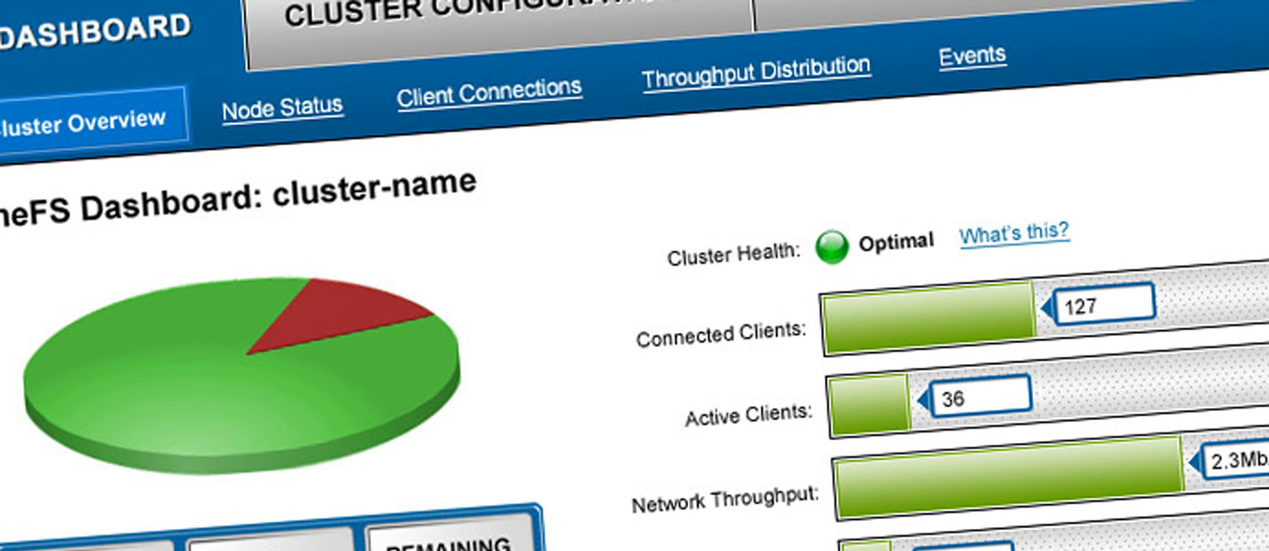
Isilon/EMC (now Dell) manufactures network-attached data storage (NAS) systems. Its primary software offerings are OneFS, the ‘operating system’ for their clustered storage systems, and Insight IQ, a full-featured analytics and reporting system offering real-time system monitoring and historical reporting. Isilon hired me to help modernize, simplify and integrate these two software packages.
Isilon’s hardware and software products are naturally targeted to a very technical user. As such, the software GUI for the operating system had originally been designed as merely a secondary alternative to the predominant command interface, and had never been updated from its ‘Windows 3.1-like’ approach. The language used was heavy and rife with insider jargon. Configuration pages were dense and poorly organized and explained. The information architecture and user flows were convoluted and tough to conceptualize. The software was extremely difficult to use, and it was getting in the way of Isilon marketing the product to a wider audience.
Additionally, Isilon had recently built a new system reporting tool and was selling the product as an add-on. This product was very powerful, but was also initially designed by developers and was difficult to understand and lacking in integration with OneFS, the operating system.
I served as the single staff UX Designer and worked closely with product owners, customers, subject matter experts and developers to research user needs and define requirements, to create information architecture and workflows, to do all interaction design and UI/visual design, and to validate design work.
I spent a great deal of time speaking with product managers and engineers to learn just a basic foundation in network operations, communication protocols, data storage, known use cases by industry, and more. I also spent a great deal of time becoming familiar and knowledgeable with the existing products, and sitting with product managers and customers discussing their needs and the product’s shortcomings.
I would redesign InsightIQ as my first responsibility; but as my job would be to redesign both software products, I was looking for points of overlap between the two products so that I could plan for common terminology and interface language, common user flows, potential for common interaction patterns and use of componentized interface elements. It was also the case that I would work hand-in-hand with a development team redesigning the command line interface, and it was a primary project goal to create and enable continuing maintenance of consistency between the GUI and the CLI.
I sat with engineers, product managers and customers to understand their perspectives on the products and how they worked well and how they did not. I watched users walk through their use of the products in their daily routine. I watched installations and upgrades and the addition of scaled-up hardware. I conducted days-long whiteboarding sessions on workflows and language.
Eventually I aggregated what I had heard and seen and represented these learnings in various visualizations of users and goals, scenarios, task flows, significant language change recommendations and more. These ideas were communicated to stakeholders and interested parties for discussion, negotiation and agreement.
After discussing inputs and negotiating goals, recommendations and scoping to a point of agreement, I designed workflows and interaction/behavior for InsightIQ working a sprint ahead of the development team within which I was embedded.
Wireframed designs were reviewed with stakeholders and iterated. Upon agreement, I did visual design/UI design for the application.
Usability testing for InsightIQ returned high results for usability, findability and perceived usefulness. Customer surveys taken after release showed high customer satisfaction. The software is still sold by Dell/EMC as an upgrade to its hardware/OS packages.