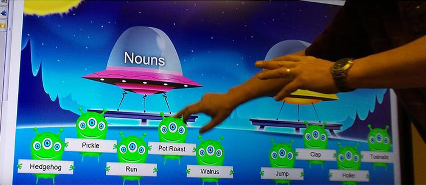
While at SMART Technologies, I designed the Lesson Activity Builder for SMART Notebook, as well as the first 7 activities that were built to populate the initial release.
SMART Technologies is the maker of the SMART Board, a large, interactive (touch-based) whiteboard that is somewhat ubiquitous in US primary and secondary classrooms, as well as several models of large-screen interactive flat panel systems. SMART also makes several software products for both education and enterprise markets that are integrated into their hardware offerings.
The Lesson Activity Toolkit included in earlier versions of SMART Notebook was built with the goal of helping teachers to build educational activities for their students using their own content. The actual product, however, was built with very little pre-defined functionality, leaving teachers to define each and every micro interaction in a very complex and difficult-to-understand flow and interface. This resulted a very low adoption rate for the software, in an evolving preference for competitor software and in risk as to whether customers select SMART hardware or competitor hardware based on their software preferences.
Upon the realization that their hardware distributors were demonstrating SMART hardware products with competitor software, SMART made a high priority of creating a better software offering.
I served as the sole UX Designer on this long-term project, but in close partnership with the Product Manager, my development team, a visual designer, an illustrator, and with real elementary school teachers and students in my community and around the world.
I worked together with this team in all aspects of the project. I helped drive definition of our goals and requirements, created workflow, designed the interaction model for activity authorship tools and for on-board activity play, validated and iterated design work through frequent working sessions with teachers and through classroom student visits, created and specified all visual/UI design, and served as Art Director for complex illustration work for activity themes.
I conducted in-class observations to understand how and why lessons are prepared, what goals lesson activities serve, and how activities are conducted during a lesson. I conducted interviews with teachers to understand needs. I drove definition of design principles, goals and direction. I mapped rough workflow of proposed functionality. I helped establish what would be built and in what order. I managed questions and built paper and low-fidelity digital prototypes to accommodate answering these questions. I had weekly calls with teachers and frequent classroom visits to validate solutions and provide new direction.
In close partnership with product team, I designed all experience and interaction for the lesson builder, lesson/content management and on-board activity play. I worked in partnership with another designer to design the final UI and visuals for board and devices. I produced fully annotated UX Specifications and Visual Specifications for each functional unit.
We began with a research phase: We 1) observed existing product users (teachers and students) in the classroom, preparing and executing lesson plans, both with and without the early product; and 2) interviewed existing product users (teachers) about their teaching processes and how the early product succeeded and failed in meeting their needs, as well as what specific improvements they envisioned in a new product.
This research yielded a very strong set of agreements on design principles, goals and direction. We used the output of this preliminary work as the guidelines for sketched design of several student activities. We created rough prototypes of these sketches and brought them into the classroom to test with teachers and students. Below are a few samples of these simple activity prototypes:
The initial concept prototype and observational details were then taken into extended working sessions with the product team to whiteboard the entire activity flow, from activity selection through activity creation, launch, play and edit.
I would then create initial low-fi designs for each activity, get initial buy-in from the team, create low-fidelity, clickable prototypes for the activity selection/creation flow and activity play, and then run 3 to 5 teachers through those prototypes for each activity via video call and screen share.
Immediately below are a few screens from one of these activity prototypes:
The observations and feedback from these calls would inform further iteration and designs would advance to wireframing and detailed behavioral specification. Immediately below are a few examples of pages from a behavioral specification:
At draft stage, behavioral specifications would be run through peer review with the entire UX team and further iteration would be made. Upon final acceptance of the behavioral spec, I would partner with a UI Designer to create a visual specification for both the activity creation wizard and the activity play itself. Each activity also had multiple visual themes from which a teacher could select — these visual themes were created by a dedicated illustrator who would work with us in establishing elements that would be dynamic and how those elements needed to be specified in the visual spec. Below are sample pages from the visual spec:
Examples of two activities and how play operates on a SMART Board are shown in the videos below.
Lesson Activity Builder was publicly released released in late 2015 to great acclaim from educators, students and industry critics, and school district software sales of SMART Notebook have increased on the basis of Lesson Activity Builder. SMART continues to improve and build out new activities and functionality on the same platform, delivered through their new Lumio product.